![]() DESIGN CASE #01 ENTRANCE (FACADE)
DESIGN CASE #01 ENTRANCE (FACADE)

We consider the entrance (façade) to be an important space that conveys the image and energy of the company to important customers,
We wanted to create a space with originality that would convey a sense of our identity.
After the CI (VI) was decided, the first thing we worked on was the design of the entrance (façade).

*We call it "CLEAD," meaning "lead (LEAD) the carbon (C).
Our logo is the ultimate in simplicity.
How to apply this simple design to the entrance?
Shimada Design's proposal exceeded our expectations.

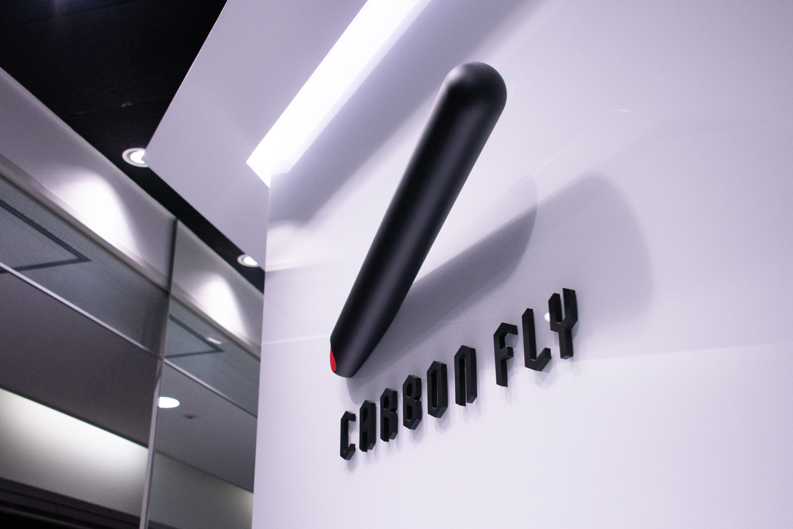
The image of our corporate mark (CLEAD) sticking out from the wall at an angle.
On-site construction is easier said than done.
We created a miniature sample in order to understand what cannot be seen on a flat surface.

After repeated discussions with the construction company, we were finally able to complete the project, taking into consideration the weight of the building.

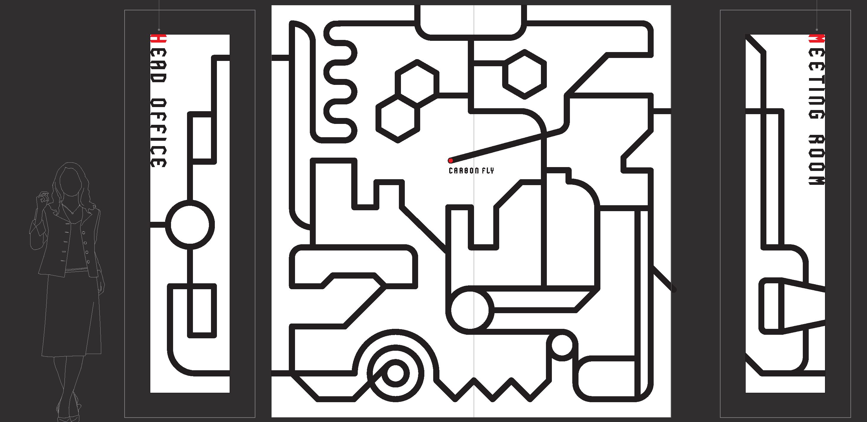
Next are the glass surfaces (3 sides) that serve as entrances to the offices and meeting rooms.

Our logo (CLEAD) was created from the beginning on the premise that it could be deformed.
Straight, curved. It expresses the future of carbon nanotubes by transforming into various shapes.

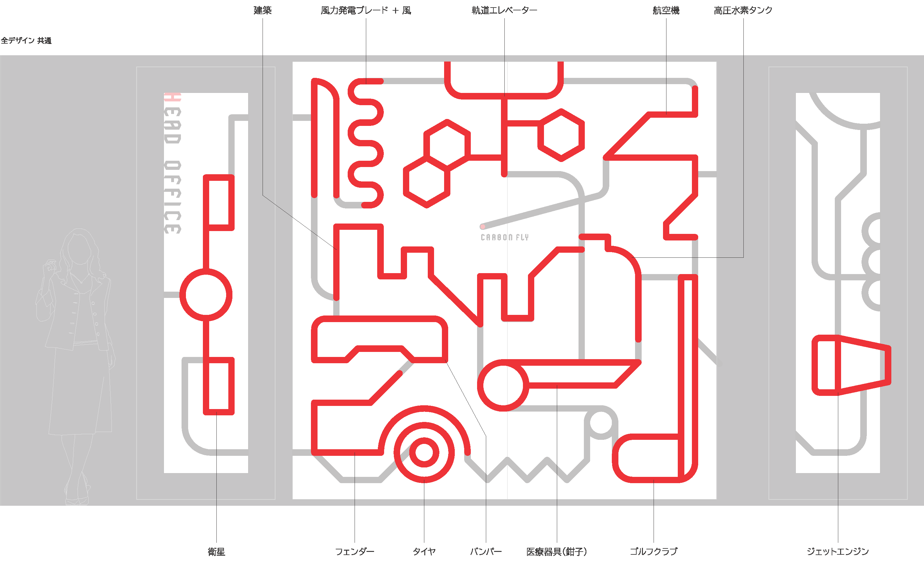
SHIMADA DESIGN's proposal was to draw the growing creed as if it were a MAP.
Here, each of the drawn shapes is expressed as something meaningful.

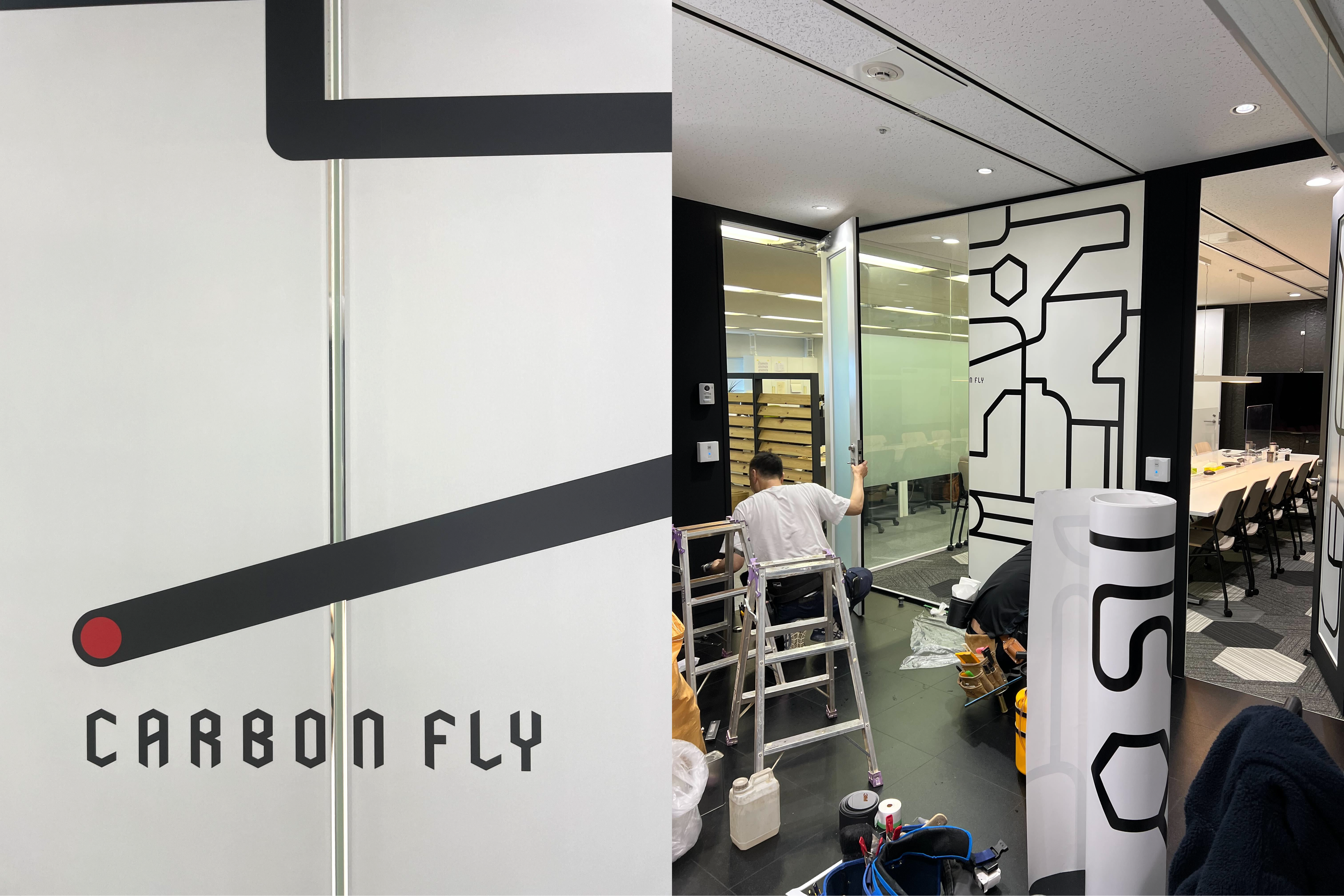
In the installation, the glass joints were also connected from above so that the black lines of carbon nanotubes would not break.
The door frames and floors, which were originally white, turned black.

We hope you will take a look at the space that best expresses our company's world view.
When you walk from the elevator hall of the building to the entrance, you will feel as if you have warped to a different space.


