
CollaborationEncounter to Collaboration.
 Bringing Dreams to the Future Society
Carbon nanotubes.
Visualizing their appeal through design.
Official Logo Mark Design for Expo '70 Osaka/Kansai
Art DirectorTamotsu Shimada
"Simplify, as much as possible". This is the the concept of CARBON FLY logo. Carbon nanotubes are hexagonally bonded and unique carbon grows in a cylindrical shape, which make carbon nanotubes orderly and beautiful. That is why we express our company simply and clear, by eliminating excess shapes and decorations.
The characteristics of carbon nanotubes, which grow linearly by bonding carbon atoms, are made as simple as possible. The cylindrical shape is expressed with a red circle, which is reminiscent of the Japanese flag, in keeping with the company's founding philosophy of becoming a new force for manufacturing in Japan.
At the same time, carbon nanotubes are a material with many possibilities, and their use will greatly change society in the future. For this reason, from the beginning of the logo design, we envisioned a future in which this simple form would change its shape in various ways to create new forms. One aspect of this is already being utilized on the top page of this site. You will see more of these developments in CARBON FLY products and events in the future.

Because the basic logo is simple, we envisioned a development that can be flexibly transformed while retaining the image.
We also envision that the evolution of materials, which is the basis of manufacturing,
will create a new dynamic in the times and society.
As for the English font used to describe CARBON FLY, this is an original, newly created font for the entire alphabet. The design is based on the hexagonal shape of combined carbon, which is elongated vertically to fit into the form of a hexagon. The design is based on the hexagonal shape of the combined carbon and is designed to fit into a vertically elongated form. Of course, this font will be used not only in the company name, but also everywhere, and will be utilized as an important element in building a unified image of CARBON FLY.

We developed an original font based on hexagons, which are easily associated with carbon materials.
The font is designed to be as light as possible without any strange decorations,
and can be used flexibly in a variety of situations.
The font is designed to be as light as possible and can be used flexibly in a variety of situations.
In designing this CI/VI, it was our passion for CARBON FLY's technology that most inspired us. If carbon nanotubes, a wonderful material, are widely used in society, we can realize a future full of dreams, from space development to the environment, medicine, architecture, and more. We want to solve the hurdles of cost and stable supply, not to mention the quality required to achieve this goal, with our own technology. We have been working on this project, sharing this very creative enthusiasm. Of course, CI/VI does not end with the completion of a logo mark. We hope to continue our cooperative relationship in all aspects, including product design.
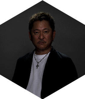
Tamotsu Shimada
<Major award history of Tamotsu Shimada>
- 2001
- All Japan DM Awards Gold Award
- 2002
- Japan Industrial Advertising Exhibition Silver Award
- 2003
- Display Design Award Asahi Shimbun Award
- 2004
- NYfestival Gold Award
- 2009
- Nationwide Catalog and Poster Exhibition, Catalog Category, Minister of Economy, Gold Award, Judge’s Special Award
NYADC Poster Gold Award / NYADC Catalog Gold Award - 2010
- NYADC Poster Bronze Award
Takeo Award Judge’s Award - 2020
- 2025 Japan World Exposition Logo Mark Best Work Award
Many other awards and selections.