
![]() Designer’s Talk : Tamotsu Shimada
Designer’s Talk : Tamotsu Shimada
Art Director
Designer of the official logo for Expo 2025 Osaka, Kansai, JapanTamotsu Shimada
In the spring of 2022, when CARBON FLY began its full-scale operations, we were stray from the path to design a logo for our company name. We had consulted and received suggestions from several designers and design companies, however, we were left with the feeling that we had seen their logos somewhere before, and several months had passed without finding a design that was uniquely our own.
Mr. Tamotsu Shimada unraveled our president Fei’s background, our carbon nanotubes, and the future that carbon fly aims to achieve. Then, he prepared four proposals for us. In the end, we chose the simplest one, which even he did not expect, but that is why we felt that it most clearly expressed the straightness that is the characteristic of our carbon nanotubes. Straight carbon nanotubes rising steadily, and then freely changing shape and spreading throughout society, was exactly the shape of the future we had envisioned. This was the moment when we encountered a design that was uniquely CARBON FLY.
It has been about a year since we started working on our corporate design, which began with our logo. Once again, we asked Mr. Tamotsu Shimada about the design for CARBON FLY.
The characteristics of carbon nanotubes, which grow linearly by bonding carbon atoms, are made as simple as possible. The cylindrical shape is expressed with a red circle, which is reminiscent of the Japanese flag, in keeping with the company's founding philosophy of becoming a new force for manufacturing in Japan.
Q.
What was your first impression when you received the offer?
A.
I was impressed with CARBON FLY's passion for technology. If carbon nanotubes, a wonderful material, are widely used in society, we can realize a future full of dreams, from space development to the environment, medicine, architecture, and more. They said they wanted to solve the hurdles of cost and stable supply as well as quality with their own technology. I shared their creative enthusiasm and decided to accept the offer.
Q.
You have designed many logos in the past, but what was your focus in creating the CI/VI for CARBON FLY?
A.
"Simplify, as much as possible". This is the the concept of CARBON FLY logo. Carbon nanotubes are hexagonally bonded and unique carbon grows in a cylindrical shape, which make carbon nanotubes orderly and beautiful. That is why we express our company simply and clear, by eliminating excess shapes and decorations.
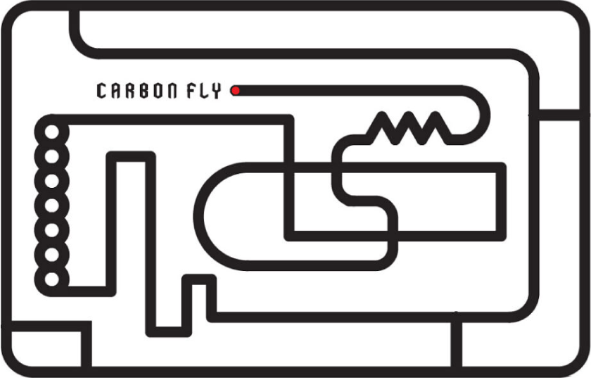
At the same time, carbon nanotubes are a material with many possibilities, and their use will greatly change society in the future. For this reason, from the beginning of the logo design, we envisioned a future in which this simple form would change its shape in various ways to create new forms. One aspect of this is already being utilized on the top page of this site. You will see more of these developments in CARBON FLY products and events in the future.
Because the basic logo is simple, we envisioned a development that can be flexibly transformed while retaining the image.
We also envision that the evolution of materials, which is the basis of manufacturing,
will create a new dynamic in the times and society.
Q.
You offered several candidates and Fei chose the simplest one.
A.
Again, I was focused on the simplicity while changeable shapes, but since it was ultimately simple, I honestly expected that other ideas would be chosen. I believe that my commitment resonated with his idea. That’s why he chose it.
Q.
You created not only the company name "CARBON FLY" but also all the fonts from A to Z, all original. I would like to ask you about your intentions.
A.
As for the English font used to describe CARBON FLY, this is an original, newly created font for the entire alphabet. The design is based on the hexagonal shape of combined carbon, which is elongated vertically to fit into the form of a hexagon. The design is based on the hexagonal shape of the combined carbon and is designed to fit into a vertically elongated form. Of course, this font will be used not only in the company name, but also everywhere, and will be utilized as an important element in building a unified image of CARBON FLY.
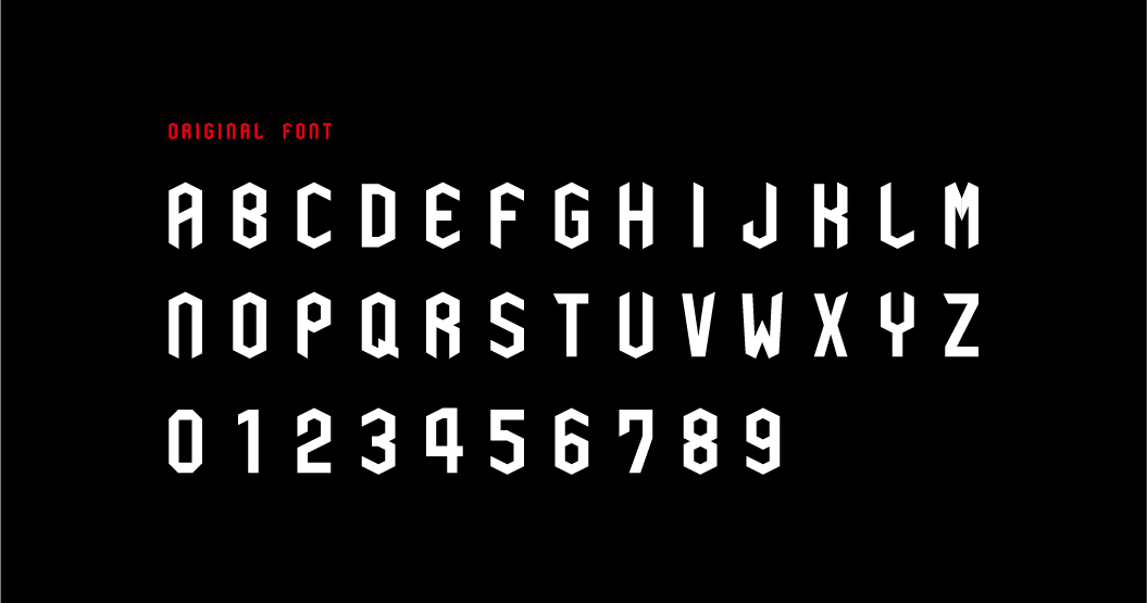
We developed an original font based on hexagons, which are easily associated with carbon materials.
The font is designed to be as light as possible without any strange decorations,
and can be used flexibly in a variety of situations.
The font is designed to be as light as possible and can be used flexibly in a variety of situations.
Over the past year, We have developed designs for various things based on our CI/VI, and we will continue to express our creativity in various applications. We will introduce them here.
<Major award history of Tamotsu Shimada>
- 2001
- All Japan DM Awards Gold Award
- 2002
- Japan Industrial Advertising Exhibition Silver Award
- 2003
- Display Design Award Asahi Shimbun Award
- 2004
- NYfestival Gold Award
- 2009
- Nationwide Catalog & Poster Exhibition, Catalog Category, Minister of Economy, Gold Award, Judge’s Special Award
NYADC Poster Gold Award / NYADC Catalog Gold Award - 2010
- NYADC Poster Bronze Award
Takeo Award Judge’s Award - 2020
- 2025 Japan World Exposition Logo Mark Best Work Award
Many other awards and selections.